31Aug/09Off
The Cube – Modern Masterpiece or White Elephant?
The final phase of The Mailbox development is nearing completion. Named The Cube, the mixed-use development will provide a new hotel, with more shops, offices, apartments, bars and restaurants around Birmingham's canal district.
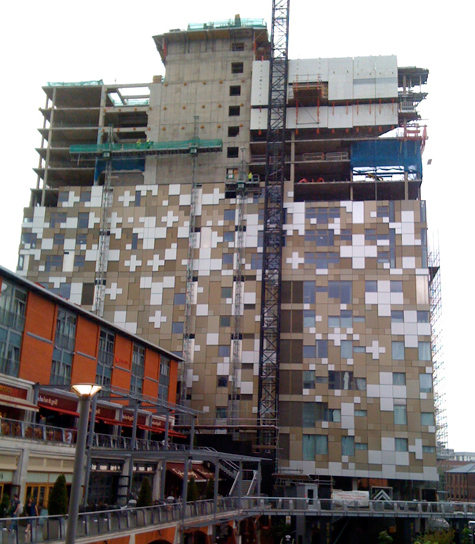
Many residents have contacted me to say the look of the building is nothing like they expected and could turn out to be an embarrassing mistake.
It was a similar story when the Mailbox itself was constructed and of course when the silver disc covered Selfridges building opened. But in time, Brummies seem to have taken both to their hearts.
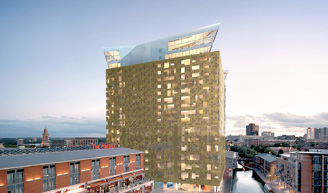
So take a look at the artists impression, followed by the actual construction of the Cube. What do you think?

The Cube - artists impression

The Cube - during construction, August 2009


August 31st, 2009 - 14:53
Another example of the council allowing huge buildings to overshadow our beautiful canals. The artist impression looked bad and in reality it looks ten times worse. With the Mailbox still not fully occupied what are the chances that this scheme will actually work?
August 31st, 2009 - 16:42
Although at present this building looks like a 70’s wallpaper inspired optical illusion. I’m personally deferring judgement until after completion. Calling something half built ‘bad looking’ is like pre-judging before you even get to know them!
Birmingham’s canal network is extensive and one of its main strengths is the varying scenery along it (from the quiet beauty of Selly Oak, through modern new developments through to the old industrial buildings down Aston side).